October 25, 2005
Powerbook tattoos
 I've flirted with the idea of getting a tattoo for ages, but never taken the plunge. Ultimately I know that no matter how cool the Wipeout 3 Pirhana logo would look emblazoned on my taut, muscled, twenty-mumble-yr-old shoulder (and I think we can all agree that "not terribly cool at all" is the answer), one day I will be a saggy old bastard with skin droopier than a lappet-faced vulture's wattle.
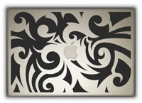
But now, courtesy of Boing Boing, I think I have the answer... get my PowerBook tattooed instead. There are only a few designs on the site so far, but it looks like they can put pretty much anything you want onto the lid.
If $200 is a bit steep, then $30 will get you a text-only etching on the back of your iPod. Mine would say, "I need recharging already."
Posted by chris at 08:04 PM | Permalink
October 12, 2005
How to avoid being (mis-)typecast
You know the kind of person who spends entire movies pointing out anachronistic period detail or other "goofs"? Gems such as, "that kind of hat wasn't produced until the 1930's" or "pah! no hacker would ever use a microsoft ergonomic keyboard!" Of course you do. In fact, if you'd been sat next to me during Die Another Day, you would have heard me muttering all the way through the "fencing" scenes.
Well, anyway, do I have a site for you. Mark Simonson's Son of Typecasting is a page dedicated to pointing out anachronistic font usage in movies and TV shows. The most recent post details font misuse in the Scorcese epic Gangs of New York, which, despite being set exclusively in the 1860's, features a number of twentieth-century typefaces:
Seriously, though, I'm actually really quite taken by Mr. Simonson's webpage. I'm always impressed when someone is able to display such complete mastery of their chosen field, and I suspect I'd be extremely hard pressed to come up with an area in which I was able to expound at such length and with such obvious authority. (For the 15-year-old me it would be Soviet and NATO military aircraft, which I was all over like a cheap suit for a while there... but that was some time ago now.)
So do check it out, and its predecessor, Typecasting, which is more of the glorious same.
Oh - and props to him for his praise of Wes Anderson's Futura obsession in The Royal Tenenbaums, which was indeed a joy to behold.
[Link via kottke.org]
Posted by chris at 01:46 PM | Permalink | Comments (6)
October 07, 2005
iBento
Surely it makes more sense to disguise your computer as a bento box than to disguise your bento box as a computer? I am of course missing the point; it's not some kind of anti-theft device, just a piece of custom laquerware.
I can't get one of these, though, as then I'd have three computers on my desk, not just two. Plus the PowerBook would get jealous, even though she's much sleeker.
Not she, "it". I meant "it".
[via Gizmodo]
Posted by chris at 01:04 PM | Permalink | Comments (3)
June 24, 2001
Monson snowboard design contest
Uh, I am working on my inbox, really I am... but I got a little distracted. Monson snowboards are having a snowboard design contest, and you can vote for your favourite. I really liked Simple, Transfusion and Billboard, none of which look like they have a chance of winning - the current first placed entry is, of course, actually the one I liked least. There's no accounting for taste.
Posted by chris at 04:44 PM | Permalink
June 21, 2001
gmtPlus9 redesign
gmtPlus9 redesigned. I generally pop in to have a "quick" browse only to come away hours later, pledging to cultivate my own sense of design and become, dammit, a better person. Get yourself a drink, get comfortable and get over there.
Posted by chris at 12:06 PM | Permalink
May 29, 2001
Let's drink very good taste
Remember the Cat & Mouse postcards I mentioned? Well, here they are.
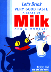
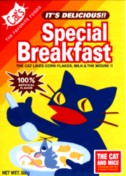
"The cat likes corn flakes, milk & the mouse!!"
(Produced by and Copyright Etsuko Fukushi)
Posted by chris at 04:48 PM | Permalink
May 28, 2001
Mind the banner
More evidence for the goodness of Flash: Mind the Banner is a showcase of Flash pieces which, I have to say, is in serious danger of rocking your world. It features projects from hi-res, Tomato (the design collective that Underworld are part of), The Designers Republic and many many more. Make sure you've got Flash installed and prepare to be sucked in.
I found this one via gmtPlus9, an Osaka-based, design-focused weblog which I came across, in turn, via centrs, a Dallas-based Japanophile I met while discussing the recent kaycee-nicole fake weblog thang. Confused yet? Just give in, check 'em all out and roll with it.
Posted by chris at 04:14 PM | Permalink
May 18, 2001
Flashturbation
Why Flash is bad:
- bloated, slow-loading splash pages
- "intuitive" navigation methods that serve only to confuse
- nasty scratchy sound loops
Posted by chris at 05:42 PM | Permalink